Narrative taxonomy in UX

design thinking, taxonomy

I’ve submitted a proposal for SXSW 2014! Vote here.

User experience and storytelling go hand in hand. UX professionals consciously apply personas, use case scenarios, underlying narratives, content strategy, and visual elements to provide a stage on which users play. But there is a key element missing in this drama: taxonomy. Much more than mere collections of categories, hierarchies, facets, and navigation elements, taxonomies “narrate the natural relationships between concepts.”

That quote is from a 2011 article in the journal Data & Knowledge Engineering, in which three computer scientists explored narrative taxonomy from the perspective of data algorithms in effective, adaptive content retrieval. This session will discuss the implications of narrative taxonomy for user experience design; specific kinds of taxonomy stories; how to recognize, analyze, and apply narrative taxonomies; and the results of user testing against different narrative taxonomies in different contexts.

Preview presentation.

Questions answered

  1. How does a taxonomy tell a story, and what are the narrative elements of that story? How can a UX professional recognize and analyze them without the help of sophisticated database algorithms?
  2. Why and when is analyzing taxonomy from a narrative perspective helpful to UX design? How does it compare to more typical approaches?
  3. In UX, taxonomy is primarily addressed by information architects and content strategists, but not always by both at the same time. Can narrative taxonomy bridge gaps between these different specialties?
  4. What does narrative taxonomy mean from an interactive perspective? What are concrete examples of this? Can users tell their own stories?
  5. How can narrative taxonomies be tested, and what are the results of such tests?

Habitual creativity: Turn around

design thinking, inspiration

For a little over two years, I left work and went to a particular bus stop on Elliott & Western in Seattle. So I spent a little time every day looking at this building, near the base of a hill leading up to the Queen Anne Hill area.

Building facing bus stop

One day, for whatever reason, I turned around and looked behind me. Due to an accident of unusual angles (hills, buildings, streets), suddenly I could see everything the building was hiding from me, including the Space Needle!

building-behind-busstop

The beauty of turning around is that it changes your perspective. Sometimes it even shows you the forest for the trees—or in this case, the neighborhood for the buildings.

So how do you turn around, metaphorically speaking? Here are some straightforward and a couple less obvious methods:

  • Try the other person’s perspective on for size. You may not end up agreeing with it, but you’ll understand it better, and this process frequently provides insight into design challenges. You UX people are used to this one. 
  • Are you looking from the outside in, or UI first? Try flipping it. Do the mental exercise of imagining your web application from the back end out – network to content buckets to databases to identifying the right content to surfacing, navigating, and consuming it. Getting a better understanding of the building blocks will let you do more with your Lego.
  • Set yourself challenges that push you beyond your normal boundaries to see the point of view inside someone else’s. For example, find a song you like in all the music genres you can think of.
  • Like sitting alone? Join a group. Like groups? Try taking some time away from them.
  • Reverse the flow. (No, not that flow.) Does your taxonomy go from broad to specific? Why not try specific to broad? Or, put everything on the same level and make it flat. The meaningful concepts will float to the top.

Simplicity is not a goal, but a tool

design, design thinking

Simplicity in design is not a goal by itself, but a tool for better experience. The goal is the need of the moment: to sell a product, to express an opinion, to teach a concept, to entertain. While elegance and optimal function in design frequently overlaps with simplicity, there are times that simplicity is not only not possible but hurts usability. Yet many designers do not understand this, and over the years, I’ve seen the desire to “keep it simple, stupid,” lead to poor UX.

I was therefore glad to see Francisco Inchauste’s well-thought, longer version of Einstein’s “as simple as possible, but no simpler” remark.

From the column:

As an interactive designer, my first instinct is to simplify things. There is beauty in a clean and functional interface. But through experience I’ve found that sometimes I can’t remove every piece of complexity in an application. The complexity may be unavoidably inherent to the workflow and tasks that need to be performed, or in the density of the information that needs to present. By balancing complexity and what the user needs, I have been able to continue to create successful user experiences.

Plus, as I’ve commented before, messy is fun!


Originally posted on former personal blog UXtraordinary.com.

Excluding data limits thought

design thinking

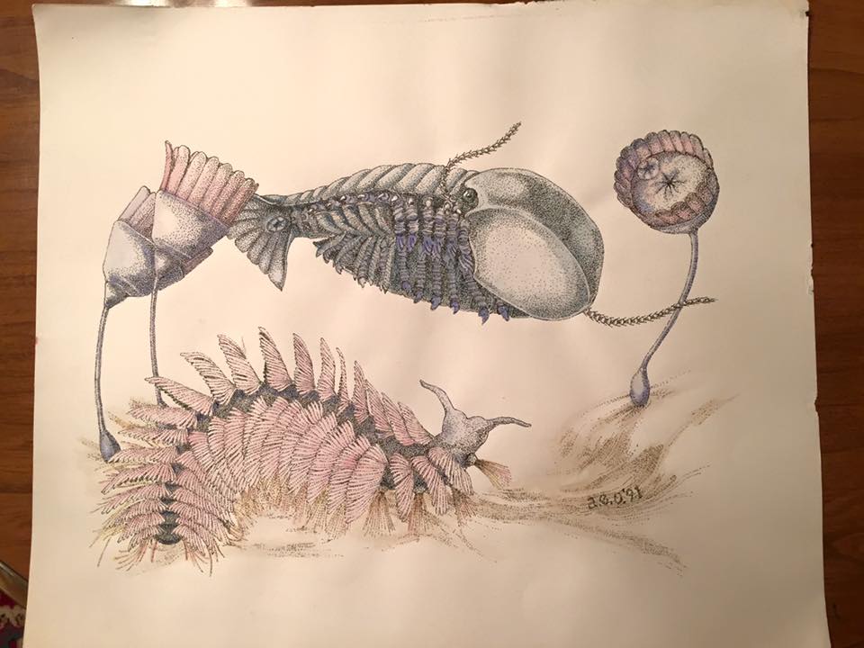
From illustrations in Stephen Jay Gould’s “Wonderful Life;” these creatures were misidentified for decades because of thought-limiting taxonomies. Stippled ink, watercolor.

I have never understood the desire to delete articles in Wikipedia solely on the basis of the highly subjective concept of “notability,” and I’ve fought against deletion of such articles. It’s easy to store the information, and it’s useful to someone or it wouldn’t be there. To these reasons I would add another: the more information you have, the more freedom you have to think flexibly about a subject.

Nicholson Baker supports the concept of a Deletopedia, a wikimorgue where all the “nonnotable” articles removed by the frustrated book-burners on Wikipedia would reside. Baker describes it:

…a bin of broken dreams where all rejects could still be read, as long as they weren’t libelous or otherwise illegal. Like other middens, it would have much to tell us over time.

Why, exactly, is this useful? Because we need taxonomic freedom.

A taxonomy is only as free as its data. The more categories you have—the more data—the more ways a given piece can move from one category to another and be connected—then the more flexibly and creatively you can arrange and understand the data. Not only does the freedom to connect and associate a given piece of data help, but each piece of data increases the number of patterns possible.

How we understand information is driven by the taxonomies—the patterns—we place it in. As Marvin Minsky said, You don’t understand anything until you learn it more than one way. The biologists have known this for some time. Initially biological species classification was based primarily on anatomy and phenotype. But there are many ways to think about organisms: according to evolutionary ancestry (cladistics), according to geography, according to the niche they occupy ecologically, to name a few. What taxonomy you choose to use determines how you’re able to perceive and understand a given organism or system.

The moment you begin to exclude and include along any lines, you begin to enforce a taxonomy of sorts. The taxonomies we use determine and limit the direction and options of our thought. We need to apply them to look at things from a given perspective, but we need to be aware of them so we can change them and see different perspectives. So, thinking in terms of deleting what is not notable is implicitly applying a self-limiting taxonomy. You will not be able to change your perspective to one that makes use of the deleted information, because you will not have the information.

This tendency by some to ignore or remove information that does not fit into their personal taxonomy of relevance is present in library cataloging, too. As a former online cataloger myself, I’m also in support of keeping analog card catalogs as well as digital. Having project-managed teams that converted card catalogs into databases, I’ve seen first-hand how subjective the choices of what pieces of information on the card get migrated onto the database can be. I think every piece of data should be online, but there are plenty of catalogers who skip over descriptive items they find trivial.

Humans are linguistic souls (even the mostly spatial types like myself), and having a new word or symbol attached to a concept immediately adds a tool to our arsenal of thought. This is why one of the first things repressive regimes do is burn the books and suppress the intellectuals. “All the Nazi or Fascist schoolbooks made use of an impoverished vocabulary, and an elementary syntax, in order to limit the instruments for complex and critical reasoning” (Umberto Eco, 22 June 1995, New York Review of Books). We do ourselves a disservice when we close off possible avenues of thought by disregarding data currently not important to us.

Besides, as Flaubert observed, “Anything becomes interesting if you look at it long enough.”

Maybe Wikipedia should make that its motto.


Originally posted on UXtraordinary.com, March 20, 2008.

Messy is fun: challenging Occam’s razor

design thinking, psychology, taxonomy

The scientific method is the most popular form of scientific inquiry, because it provides measurable testing of a given hypothesis. This means that once an experiment is performed, whether the results were negative or positive, the foundation on which you are building your understanding is a little more solid, and your perspective a little broader. The only failed experiment is a poorly designed one.

So, how to design a good experiment? The nuts and bolts of a given test will vary according to the need at hand, but before you even go about determining what variable to study, take a step back and look at the context. The context in which you are placing your experiment will determine what you’re looking for and what variables you choose. The more limited the system you’re operating in, the easier your test choices will be, but the more likely you are to miss something useful. Think big. Think complicated. Then narrow things down.

But, some say, simple is good! What about Occam’s razor and the law of parsimony (entities should not be unnecessarily multiplied)?

Occam’s razor is a much-loved approach that helps make judgment calls when no other options are available. It’s an excellent rule of thumb for interpreting uncertain results. Applying Occam’s razor, you can act “as if” and move on to the next question, and go back if it doesn’t work out.

Still, too many people tend to use it to set up the context of the question, unconsciously limiting the kind of question they can ask and limiting the data they can study. It’s okay to do this consciously, by focusing on a simple portion of a larger whole, but not in a knee-jerk fashion because “simple is better.” Precisely because of this, several scientists and mathematicians have suggested anti-razors. These do not necessarily undermine Occam’s razor. Instead, they phrase things in a manner that helps keep you focused on the big picture.

Some responses to Occam’s concept include these:

Einstein: Everything should be as simple as possible, but no simpler.

Leibniz: The variety of beings should not rashly be diminished.

Menger: Entities must not be reduced to the point of inadequacy.

My point is not that Occam’s razor is not a good choice in making many decisions, but that one must be aware that there are alternative views. Like choosing the correct taxonomy in systematics, choosing different, equally valid analytic approaches to understand any given question can radically change the dialogue. In fact, one can think of anti-razors as alternative taxonomies for thought: ones that let you freely think about the messy things, the variables you can’t measure, the different perspectives that change the very language of your studies. You’ll understand your question better, because you’ll think about it more than one way. And while you’ll need to pick simple situations to test your ideas, the variety and kind of situations you can look at will be greatly expanded.

Plus, messy is fun.

Originally posted on former personal blog UXtraordinary.com.