Why jargon matters

career, design
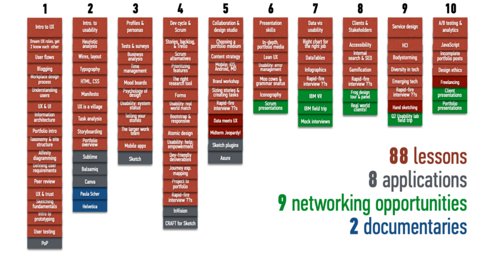
A syllabus from one of my UX classes; just the lesson titles are full of jargon! Each column is a week of lessons and events.

A syllabus from one of my UX classes; just the lesson titles are full of jargon! Each column is a week of lessons and events.

My ex-spouse, bless his heart, contributed some good to my life. (I can say this twenty years later, sixteen years into a marriage to the right partner. About the first one, all I can say is that every relationship sucks if it’s the wrong one, no matter how well-intentioned and good the people involved.)

Possibly the most important good he contributed to my tech career was this advice: “Jargon matters.”

Let me say that again, more loudly:

Jargon matters.

Everyone hates jargon, right? It’s used by some to exclude outsiders and preserve territory (lawyers and doctors, I’m looking at you!), or by others to show off being part of the “in” group at work. Sometimes it’s misused, and depending on the likability of the person making the mistake and the empathy of the observers, colleagues feel one of two excellent German concepts: Schadenfreude (pleasure in another’s misfortune) or Fremdschämen (embarrassment on someone else’s behalf).

You cannot

life, writing
Edited version of a painting of a dream: plugged volcanoes with a cresting wave beyond them, poised to fall.

Edited version of a painting of a dream.

End a life, end a world.

Replace the irreplaceable eye, the singular perspective, the experience of
loving joyful bored stalwart fearful brave angry mean kind hateful cool excited passionate
people breaths blinks touches hands grasping music-hearing whispering shouting standing
filled with skies words inmost dreams sensuous interactions and each other’s ideas and the patterns only we see,
replace all that I
with—nothing.

Negative space makes a space, filled by vacuum-abhorring nature with
the attention of more
Worlds.

worlds, not
units in Venn diagrams
tagged by our characteristics, falling into slots as
predictive analysis charts soulless identity probabilities,
pitting us against each other, pitting us against ourselves, because
we are many-layered and our tags are not reasonable, they are us,

each not a unit in a mob of units with concentric permission levels but

a world entire, interacting and seeing and regarding and thinking and reacting and caring,
the appetitive psychosomatic unity a universe entire,
bumping up against and overlapping the worlds around us.

You cannot choke a world
You cannot chase and shotgun a world
You cannot kneel on a world

Without rousing the world of worlds against you.

Save a life, save a world.


Originally posted on Medium.com on May 31, 2020. Black lives matter.

Anti-fragile UX

cognitions, design, design thinking, strategy

This is a repost of an idea I’ve dreamt of for nearly a decade (and leveraged to help improve design thinking and approaches, though not to the extent described below). Now, in this time of AI, global audiences, and awareness of accessibility, it seems this could be possible. (Please note: some links now go to the Wayback Machine capture of a site.)


Nobody wants a fragile user experience. The thoughts that come to mind when you imagine such a site are probably buggy, not very usable, difficult to navigate, limited compatibility, and most definitely not user-friendly.

Now imagine a robust web app. This site would work across most if not all browser and devices, “gracefully degrading” when necessary. It would be usable, useful, and user-friendly, fulfilling the promise of site for the user. Bugs would be a rare event.

After reading Nassim Taleb’s antifragility discussion on Edge’s World Question Center, I think we can do better. As Taleb envisions it, an antifragile system is one that is “beyond robustness,” one that not only withstands disorder and change, but loves those things. Taleb provides an example:

Just as a package sent by mail can bear a stamp “fragile”, “breakable” or “handle with care”, consider the exact opposite: a package that has stamped on it “please mishandle” or “please handle carelessly”. The contents of such package are not just unbreakable, impervious to shocks, but have something more than that, as they tend to benefit from shocks.

So let us coin the appellation “antifragile” for anything that, on average, …benefits from variability.

In this and following posts, I’m going to discuss what the characteristics of an anti-fragile web app might look like. These include (but are not necessarily limited to):

  • A self-refining interface. The more browsers, devices, and user preferences it’s exposed to, the better it can refine itself, and predict or suggest the ideal UI for a given user with a given browser or device.
  • Self-refining taxonomy. A content strategy that benefits from variety and size. I’m convinced that in the post-Google, post-UX, post-social media world, semantic information management in all forms will be the next big thing. (Note: by post-Google, post-UX, etc., I don’t mean a world existing without those things. Rather, I mean the world that has thoroughly incorporated these and similar game-changing concepts and is ready to grow from there.)
  • Simplicity of structure, allowing flexibility of response.
  • Loves change. Learns from being used for new and unexpected purposes, adapting the new ability or use to improve or expand existing features.
  • The broader and more varied the audience, the more information there is to develop targeted content and interfaces.

self-refining interface

What on earth is a self-refining interface? A self-refining interface is one that adjusts itself to user needs, either at an aggregate or individual level. Ideally it would do both.

Today we have a plethora of interfaces with which to browse the web. Notepads, smart phones, PDAs, laptops, televisions and more are used to present online information. There are even a few awkward-looking wristwatches receiving online updates, heralding the arrival of the smart gadget. The Pew Internet & American Life Project reports a sharp increase in adults using mobile devices to access the internet, as well as other online activities. Cell phone ownership is stable, but using phones for purposes other than phone calls is going up, up, up.

This marks the beginning of the end of pixel-perfect web design. No longer is there a single fold, above which content cues should reside; no longer can a company focus solely on meeting their audience’s needs by designing for the top three browsers across the top two computer operating systems. Graceful degradation is going the way of the dodo. Instead, we need evolutionary designs, adaptable to a variety of niches.

Companies who have already focused on this typically seek to determine the device being used by a particular user, then serve them content optimized for that device. Unfortunately, with the broad variety of devices in use, it’s difficult to accommodate all of them. Alternatively, they offer a “mobile” or “text-only” link, optimized for users with low bandwidth or smaller mobile devices. Again, we have only a couple of optimizations, and as user trends change, the developers behind a given web application or site must run to keep up.

Built-in design adaptability might work in many cases. For example, a combination of incrementally sized, wrapping modules and liquid layout could flexibly accommodate both broader and shorter resolutions (the Xoom’s resolution, for example, is 1280 x 800). Navigation could be persistent, but fly out on mouseover. Tricky to do, but not impossible. There is no “graceful degradation” because all resolutions are intended to happen. But this is merely robust.

What if the web application itself took this optimization a step further? Imagine these scenarios:

A site that actively analyzes user system demographics and develops UI and navigation options for a variety of interfaces; users can select their preferred default. Depending on the intelligence of the system, these could be based on persona types, or actually customized on a user-by-user basis.

Proactively personalized interface preferences. Based on a user’s interaction behavior, the site infers their content and navigational preferences and presents or suggests an interface matching those. Do they like clicking on tags? Perhaps a tag cloud-driven navigation should be integrated into their UI.

To be honest, I’m not certain what a truly antifragile user experience would look like. But I know we’ll never get there if we don’t think about it; and thinking about it will bring us more robust UX along the way.

references


27 February 2011

Originally posted on UXtraordinary. See the archived original post.

A proud moment at GA: Integrating the highest lesson rubric requirements into the lesson format

Constant learning is constant humility

career, psychology

This morning I shared a bit of what the learning part of design meant to me in an email, and decided to expand on that.

Working in design means constantly learning. You have to make like a sponge and absorb the field you’re supporting, the user’s language and perspectives, the platform your design is being built with, and so much more. In my career alone I’ve supported users in healthcare SaaS, a social network, several technology companies, shoe retail, a veterinary clinic, an advertising/promotional agency - you get the picture. I’m sure there are agency designers and freelancers with an even more varied set of personas.

Sometimes that can be daunting. Many people in this field suffer from imposter syndrome: the sense that they are faking it, and someone will notice someday. The fact that no one has noticed, and that their work is excellent, doesn’t seem to stop them from this underlying insecurity. I would like to suggest that this is less about actual insecurity, and more about the nature of constantly learning things beyond design in order to perform design.

Beautiful, accessible traffic light colors

design

Cross-posted from my Medium blog.

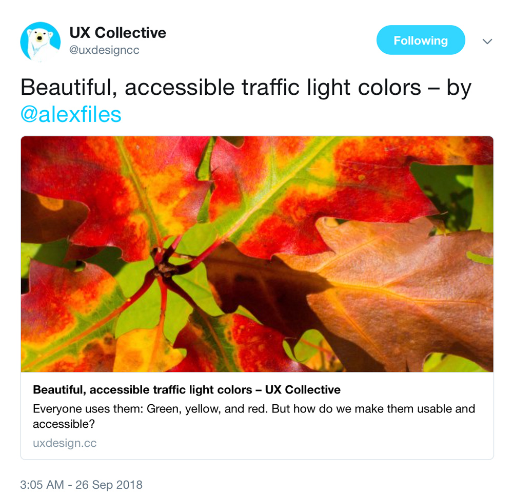
Gorgeous red, yellow, and green autumn leaves from enneafive of Flickr
Autumn leaves showing off a glorious red/yellow/green palette. Photo by enneafive of Flickr, under Creative Commons by 4.0 license. Links below.

Everyone uses them: Green, yellow (or orange), and red. We use them in data visualization, we use them in buttons, we color text and icons with them and put them into alerts. They are often used in crucial moments, when we are announcing success, or breaking bad news. We abuse them, too, using them to draw attention where they aren’t relevant. What we don’t do, far too often, is make them accessible.

A significant minority of people are color blind, and most of those have red-green color blindness. Since 2011 I’ve had to solve for color accessibility in important interactions, such as alerts for patient vitals, quality of patient care, cloud server status, or executive sales analytics. Here are some accessibility tips I’ve picked up along the way, as well as my personal template for a usable, accessible traffic color palette.

I presented Narrative Taxonomy at Austin UXPA!

career, taxonomy

Slide "storytelling and taxonomy" from UXPA Narrative Taxonomy presentation.I was thrilled to be able to share my design-focused narrative taxonomy concept and process at the Austin UXPA, hosted by Rackspace. Great crowd, great discussion, great experience. Thanks to organizer (and user research guru) Candice McFarland for organizing this!

Narrative Taxonomy UXPA presentation

Originally posted on former personal blog UXtraordinary.com.

The man my great-uncle didn’t kill

career, psychology

Cross-posted and expanded from my LinkedIn account.
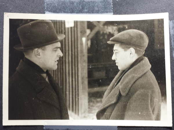
My grandfather and great-uncle during WWII
My grandfather and uncle talking at the German-run camp my uncle was in during World War II.

Everyone demonstrates the fundamental attribution error—a variation of correspondence bias (pdf)—to some extent. We look at the action and assume it’s the character. Even when we know there are extenuating circumstances we do it. The defense lawyer, doing his duty to provide the best defense possible, is seen as supporting crime. The debate student, assigned to defend a certain position, is seen as believing it; no matter the usefulness of the role or the purity of intent, every devil’s advocate runs the risk of being seen as devilish. And of course, the criminally negligent incompetent person driving the car that just cut us off.

In the workplace this can create misunderstandings, usually small but sometimes project-killing or even career-destroying. It’s a problem because the only way to overcome correspondence bias and not commit the fundamental attribution error is to constantly question your assumptions and opinions, looking for the larger context.

Since we’re all story-driven creatures, sometimes an anecdote can help. This is a story of a time a life was on the line, and it’s the best example of correspondence bias I know.

My mother’s uncle was a man named Jara. He was my grandmother’s brother, an artist when he could be (I saw beautiful sculptures and drawings in his widow’s home). His best friend, whose name I don’t know, was a professional artist.
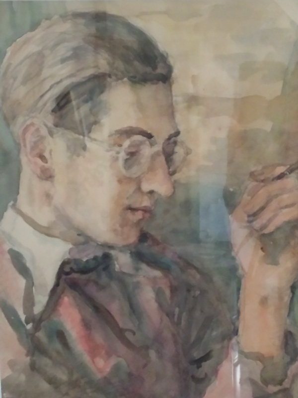
Watercolor portrait of Uncle Jara by a friend
A watercolor portrait of Jara by his best friend, faded but still showing great talent.

During Hitler’s occupation of Prague, Jara and his best friend were sent to a labor camp. At the camp worked another man whose name I don’t know. Let’s call him Karel. Karel worked as an overseer, managing his fellow citizens for the Nazis. Karel was hated. He treated everyone “like a dog,” Jara said, swearing at them and driving them mercilessly, generally making the labor camp experience every bit as awful as you imagine it to be.

Watching Karel’s behavior, day in, day out, Jara and his friend eventually realized Karel could not be allowed to live. It was obvious to them. Karel was a traitor, a collaborator with the enemy, and responsible for much misery. They were young, and passionate about their country. They made a pact together, that if all three of them survived the war, Jara and his friend would hunt down Karel and kill him. They viewed it as an execution.

The war ended, the labor camp closed, and life continued for all three men. Jara and his friend discreetly found out where Karel lived. They obtained a gun, and one day they set out to his home.

Karel lived outside Prague, in a somewhat rural area. When Jara and his friend arrived, Karel’s wife was outside, hanging laundry. When they said they’d known Karel at the labor camp, she smiled and invited them in, calling to Karel that friends from the camp had arrived. They followed her to the kitchen, where they found the monster they sought.

Karel was sitting by the table with a large tub of water and baking soda in front of him, soaking his feet. He was wearing rolled-up pants, suspenders, and a collarless, button shirt, the kind you could put different collars with under a jacket. He greeted them with a broad smile, immediately calling them by name and introducing them to his wife. Jara said Karel was so happy, he had tears in his eyes. He asked his wife to give them coffee, and she brought out pastries, and all sat down to talk about old times.

Jara and his friend were dumbfounded, but did not show it. During the conversation they realized that Karel had not thought of himself as collaborating with the Nazis, but as mitigating their presence. He was stepping in so no one worse could. His harshness was protective; the Germans could not easily accuse the workers of under-producing when Karel pushed his fellow Czechs so hard.

They stayed several hours with Karel and his wife, reminiscing and privately realizing no one was getting shot that day, then took their leave. On the way back they threw the gun into a pond. Jara went on to work at the Barrandov film studios, where he met his wife, Alena (she was an accountant). They married, lived a long life, and were happy more often than not.
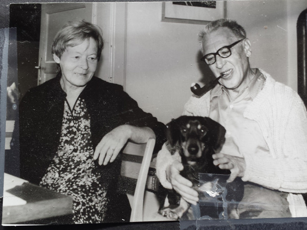
Jara and Alena with their dog.
Jara and Alena and a canine friend.

Jara was transformed by this experience. Never again would he take any person’s actions as the sum of their character. And I do my best to see things in context and not judge, in part because of the man my great-uncle didn’t kill.