Pabini Gabriel-Petit approached me for an article in UXmatters in May, 2012, and in July published Intention-Focused Design: Applying Perceptual Control Theory to Discover User Intent. Below is the article as it appeared.
At this point in the development of the field of user experience, I’m assuming that most good UX professionals know how to tailor sites or applications to user profiles, create personas, and tell a compelling story that drives user process flows. But sometimes we encounter a situation that’s a bit more challenging: we’re asked to design one product for very different users—or even users with seemingly conflicting goals.
Without a unifying narrative, such challenges can result in compromised user experiences. A client, or even a UX designer, may find it simpler to either target the most valuable or common user profile or to design very different process flows and interactions for different users. These approaches aren’t necessarily bad, but integrating them gracefully is difficult without a shared context. Intention-focused design is a specific UX strategy that can help you to discover hidden and shared user narratives.
Perceptual Control Theory and User Intentions
You know you’ve got a good piece of software when people use it for purposes for which the designers never intended or designed.
—Clay Shirky
Psychology is the UX designer’s friend. We use it all the time. Our process flows and interfaces apply learning, perception, and cognition theory. Decision-making research, gamification, and emotional appeals evoke the appropriate response to the stimuli we provide. But the most useful framework for understanding users that I’ve encountered is a little-known system called Perceptual Control Theory (PCT). The invention of William Powers, an engineer with degrees in physics and psychology, PCT is based equally in cybernetics and psychology. It has recently been gaining ground as a useful framework in areas such as education and psychotherapy.
The basic premise of PCT is that human behavior is not about the behavior itself, but about reinforcing desired perception. William James said, “My experience is what I agree to attend to.” William Powers suggests that behavior is not just about agreement, but about constantly refining our experience to achieve an agreeable level of perception.
For example, a bagger at a grocery store who packs items carefully—cold with cold, fragile on top—may be reinforcing a self-perception as a caring, careful person. An executive who signs the order for a layoff may be reinforcing a self-perception as a strong, dominant person. A voter voting against his own interests may be reinforcing a perception of himself as a moral person. A programmer who writes elegant code may be reinforcing a self-perception as being a particularly rational human.
PCT suggests that a person starts off with a desired reference point for her experience. (This may change over time.) She compares her environment to that reference point and takes action to bring it closer to her desired perception. She compares the result to her reference point and acts accordingly. If something external, called a disturbance, interacts with her environment, the same comparison of input and reference point recurs, resulting in the appropriate output, or behavior. This feedback loop is the core of PCT. As Powers wrote, “Control is a process by which a person can maintain some controlled variable near a reference condition by varying actions that oppose the effects of disturbances.”
In UX terms, users actively work to optimize their own experience as much as possible. Let’s take a look at how a user-focused PCT feedback loop works, as shown in Figure 1.
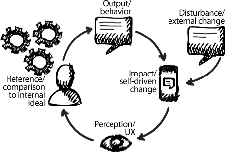
Figure 1. A UX-style PCT user feedback loop
PCT goes further: it reminds us that what we think a person is doing and what they think they’re doing can sometimes be very different. Powers demonstrated this very simply at a presentation to the American Education Research Association in the 1990’s.
Using a large, knotted rubber band, a chalk board, and a piece of chalk, he asked a volunteer to maintain the knot over a dot, while also holding a piece of chalk there. Powers then pulled the other end of the rubber band around in a large circle. Although Powers took care to move deliberately and not too fast, the volunteer’s chalk described a smaller circle on the board. Powers then asked the audience what the volunteer had done, and they replied that he had drawn a circle. But when Powers asked the volunteer what he’d done, he said he had held the knot over the dot.
The volunteer neither expected nor intended to draw a circle, but worked to maintain the knot’s placement. However, despite hearing the instructions and watching the demonstration, the audience had seen the visible evidence of the volunteer’s behavior, the circle, as the primary object. An analyst looking at the behavior without having heard the instructions might easily take the circle to be the purpose of the exercise.
PCT is valuable to UX designers because it helps them discover what users actually think rather than what we think they think.
Transformative Design
Several design challenges benefit directly from intention-focused design. Next, I’ll discuss how to apply intention-focused design when we’re asked to transform a site or application.
Occasionally, a UX designer or creative team receives a request to completely re-envision a site or application. Perhaps the company’s business value is changing, or the site has to adapt to the mobile world. Yet the site may have a strong following of users who are content with the site as it is, so resist change. Often UX designers offer users a more usable interaction, then are surprised by a vehement negative response. It’s a truism that users resist change. The PCT insight that people desire equilibrium at their personal reference point goes to the heart of this.
A person’s desired reference states operate in a hierarchy of importance and awareness. People work to maintain equilibrium at different levels of being. I’ve adapted this hierarchy for a compassionate animal lover from a 1982 diagram from psychologists Charles Carver and Michael Scheier:
- System concept: Be a compassionate person.
- Principle: Be kind to animals.
- Program: Walk the dog.
- Relationship: “Dog walkingness” sequence: Keep the dog from running into traffic by pulling on his leash, tightening his choke collar. (I know, I know. Wait for it.)
- Transition: Pull on the leash.
- Configuration: Fingers around the leash.
- Sensation: Friction of the fabric against your fingers.
- Intensity: Muscle tension.
The animal lover simultaneously compares all of these perceptions to an expected, desired reference point, but those that are lower in the hierarchy can change in response to new information—provided they match the deeper expectations of system and principle. But I know that choke collar is bothering you, so let’s provide our dog owner with new information: choke collars are painful to dogs. The animal lover’s self-perception as a compassionate person and the principle of kindness to animals trumps maintaining equilibrium in the “Walk the dog” program or “dog walkingness” relationship. A new program appears: Buy a walking harness.
You have to address not just the level of environmental equilibrium, but the deeper levels of purpose and self-perception. Not doing this can result in debacles like the Netflix separation of streaming and DVD viewing. Had anyone at an empowered level said, “Customers don’t want DVDs or streaming video, they want movies and entertainment,” they might have averted the loss of customers. Great design actively engages purpose and self-perception to change the user’s environmental expectations, effectively resetting their equilibrium to a new state.
The Hidden User
Sometimes a site’s users are not the only participants in its narrative. For example, the medical software company I work for provides software for quite a few highly specific user personas: nurses, therapists, schedulers, billers, marketers, and more. Some of these are not only very different, but initially seem to have conflicting interests.
I struggled with this when I first began—looking for the underlying hook that would tie a good, user-centered design together; chunking out different user activities; getting data from customers and coworkers who knew them deeply. But it was a PCT analysis of their intentions that exposed their shared narrative. Part of every persona’s internal script was a hidden user the persona focused on every day: the patient. From then on, patient first became the design mantra, and I’ve set aside all design that doesn’t center on that hidden, absent user.
A retail site offering educational toys and tools for children offers another example of a hidden user. Parents, educators, and others are on the site, but the purpose they all have in common is a better-educated child who enjoys learning. That child is the absent user, providing the context for a taxonomy based on age, special needs, specific curricula, and other factors driving customer intention.
User-Empowering Design
When designing solutions for user activities, it is very easy to fall into the common-sense trap. Anyone trained in experimental methodology knows that common-sense assumptions are often proven wrong. For example, in a study of the likelihood that drivers would call 911 or otherwise act in a dangerous situation, the results were surprising.
Someone looking like a small child walked beside a rural road, a suburban road, and a busy highway. Common sense might make people expect more 911 calls from the busy road, because more people were there. But the opposite occurred: the more people were present, the fewer calls or offers of help they made. Analysis revealed that drivers on the little-used road figured there might not be anyone else to help, so they took action. Drivers on the busy highway figured someone else must’ve already called, so took no action. The response on the suburban road fell in between.
My favorite example of a common-sense design mistake is the typical business mental model for sharing user-generated content. Viewing users as single units in a much larger pool of users, who touch only some of that pool, businesses place a user at the center of an ever-expanding circle of sharing: user, friends, site members, public, as shown in Figure 2.
But users don’t perceive themselves that way. They experience themselves as the horizon between their self and their world, and they adjust how they share according to a greatly varying series of needs. With a friend, they might share dreams and romantic details, but not the physical details of a medical problem. With a doctor, the opposite holds true. Both kinds of data are intimate details, but shared intimacy is not the same across the board. Different groups of people receive different kinds and levels of information.
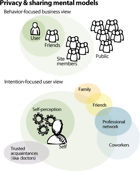
Figure 2. Typical behavior-focused business concept of a user’s mental model versus an intention-focused model.
Here, the user’s system concept might be a desire to be likable to as many people as possible. As a result, the user might share only information that is appropriate, to avoid putting people off by sharing too much. Of course, people vary, and context should always drive analysis of user intentions. LiveJournal got this years ago, offering highly customizable, user-created groups years before other social networks—but the social circles of Google+ are hands-down the best design implementation of it.
Recap
Intention-focused design deliberately empowers users as active, goal-driven participants in shaping their experience. In this article, my goal was to introduce the concept of Perceptual Control Theory at a high level, showing why it redefines our basic understanding of user analysis beyond site interactions and immediate goals to deeper levels of intent. As examples, I showed three strategic uses of intention-focused design: getting a handle on site transformation, discovering hidden users, and empowering users through design.
References
Carver, Charles S., and Michael F. Scheier. “Control Theory: A Useful Conceptual Framework for Personality—Social, Clinical, and Health Psychology.” APA Psychological Bulletin, 1982, Volume 92, Number 1.1.
Powers, William T. Behavior: The Control of Perception. 2nd ed. Montclair, NJ: Benchmark Publications, Inc., 2005.
Powers, William T. “The Nature of PCT. Control Systems Group. Paper presented at the annual meeting of the American Educational Research Association, April 1995. Retrieved June 1, 2012.
Originally posted on UXmatters and cross-posted on former personal blog UXtraordinary.com.
Like this:
Like Loading...

 Pumpkin + pecan + apple pie crumble = Venn pie-agram
 Making the superset framework for a Venn pie-agram.
 Detail, cut and overlapping sides.
 Any experience with tin foil hats helps in this step.
 Keep your excess pie dough!
 Little metal dividers not only leak, but the necessity of removing them before eating would ruin the pie.
 This piece will form part of the crust defining the overlapping sets in our Venn pie-agram.
 This is what your middle should look like. It’s not perfect circles, but trust me, you’ll prefer this when creating your overlapping fillings.
 Use baking time to clean your workspace! (How else will you have room for photos at the end?)
 On its way into the oven!
 A Venn pie-agram triumph! Or, the mother ship and her fleet. Whichever you prefer.
