Cross-posted from my Medium blog.

Autumn leaves showing off a glorious red/yellow/green palette. Photo by enneafive of Flickr, under Creative Commons by 4.0 license. Links below.
Everyone uses them: Green, yellow (or orange), and red. We use them in data visualization, we use them in buttons, we color text and icons with them and put them into alerts. They are often used in crucial moments, when we are announcing success, or breaking bad news. We abuse them, too, using them to draw attention where they aren’t relevant. What we don’t do, far too often, is make them accessible.
A significant minority of people are color blind, and most of those have red-green color blindness. Since 2011 I’ve had to solve for color accessibility in important interactions, such as alerts for patient vitals, quality of patient care, cloud server status, or executive sales analytics. Here are some accessibility tips I’ve picked up along the way, as well as my personal template for a usable, accessible traffic color palette.
Use icons as well as color
You may design a beautiful, color blind-friendly palette, but it never hurts to reinforce the message. Instead of changing text to red or green, put a differently shaped red or green icon next to the text. That way, even if you have no control over your color palette, or the chart has been printed in black and white, or your user sees only in grays, you’ve made your point.
Case in point: Excel. Excel offers icons in traffic light colors to help tell your data story. Make sure you use differently shaped icons as well as different colors! Here’s why:
![]()
Desktop Excel, Office 2013. Pay attention to the red and green circles — could you tell them apart easily? Microsoft resolved this issue in later versions.
Deuteranopia and protanopia are two common types of red-green color blindness. Testing your colors against them will optimize for most of your users, but icons help seal the deal.
Don’t trust preset color palettes
There are many extremely useful frameworks and boilerplates online. Each meets many needs, but not all have had the time to optimize their colors for color blindness.
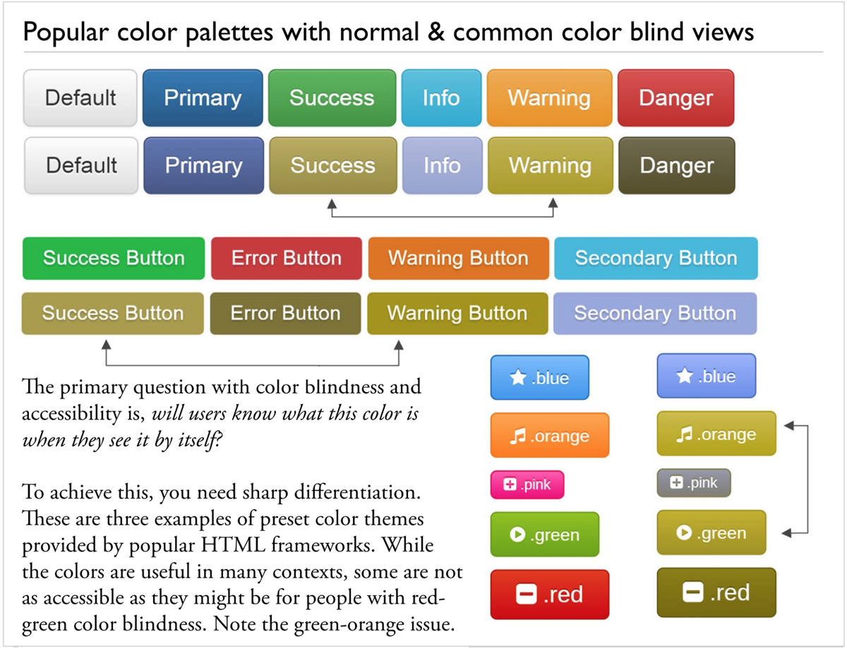
Examples of popular preset color themes that didn’t check for accessibility in color usage. (Or, “Why not to use orange.”)
The most important question when looking at your reds, greens, oranges, and yellows is, “Will my users recognize this color when they see it by itself?” Don’t trust the people who created your framework to have thought of this. Check it out for yourself.
Common colorblindness checking with Adobe
How do you do that, you ask? For many years the only solution I found for testing was Adobe’s PhotoShop, which offered protanopia and deuteranopia views of whatever I was creating. The options are under View → Proof Setup (see image below).
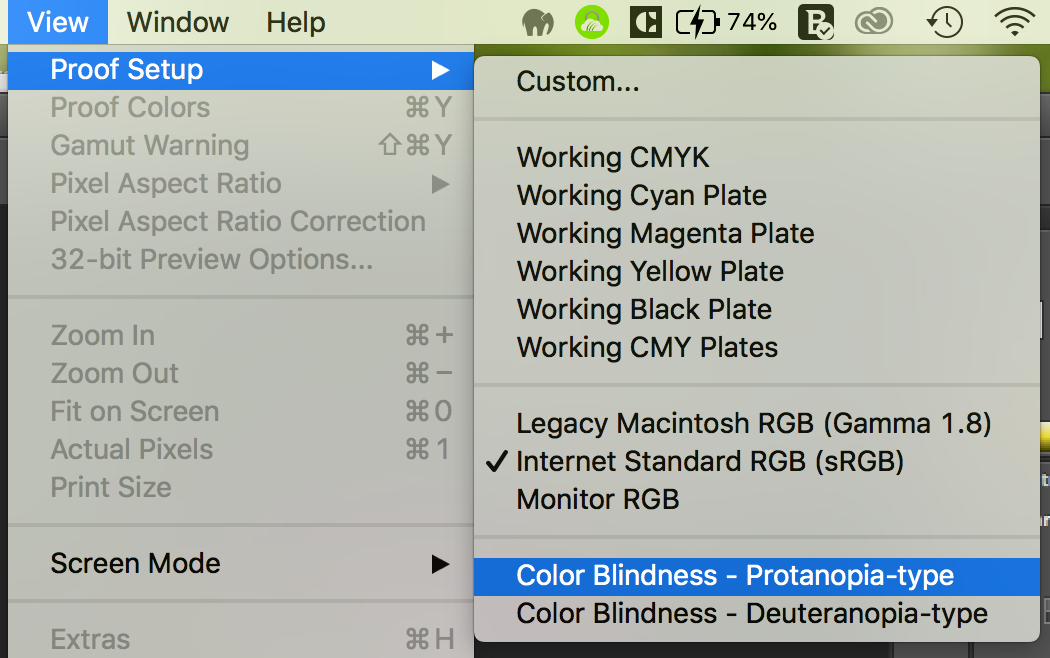
Screenshot: finding the colorblindness previews in Adobe Photoshop.
Recommended online colorblindness checker
The Corblindor Coblis (Color Blind Simulator) is now my go-to tool. Just do a quick screen shot of your work, and see how it looks for many different types of colorblindness.
Plan ahead with a color template
I’ve done a lot of data visualization color work over the years, and a pattern has emerged that I find helpful. I’m offering it here, in the interests of making data more usable. I strongly recommend considering this approach when you’re developing a brand color palette.
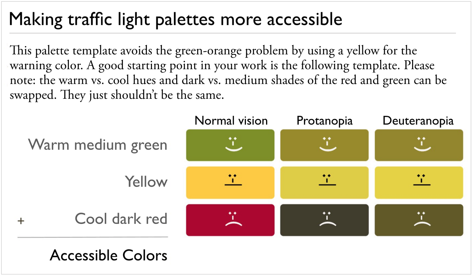
Notice how light vs. dark and warm vs. cool differentiate the red and green. Your yellow should be significantly lighter than either your red or green!
Here are the key guidelines:
- Use a light, medium, and dark shade. Your yellow should be your light shade.
- Use a warm green and a cool red, or a cool green and a warm red. Just don’t have both cool or both warm.
- No orange. Because it’s so much lighter, using yellow instead of orange makes it much less likely your “warning” color will conflict with your “success” green to color blind users, or look too much like your “serious problem” (errors, e.g.) red.
That’s it! Thanks for reading. Go forth and have fun telling good stories with your data.